Quick answer
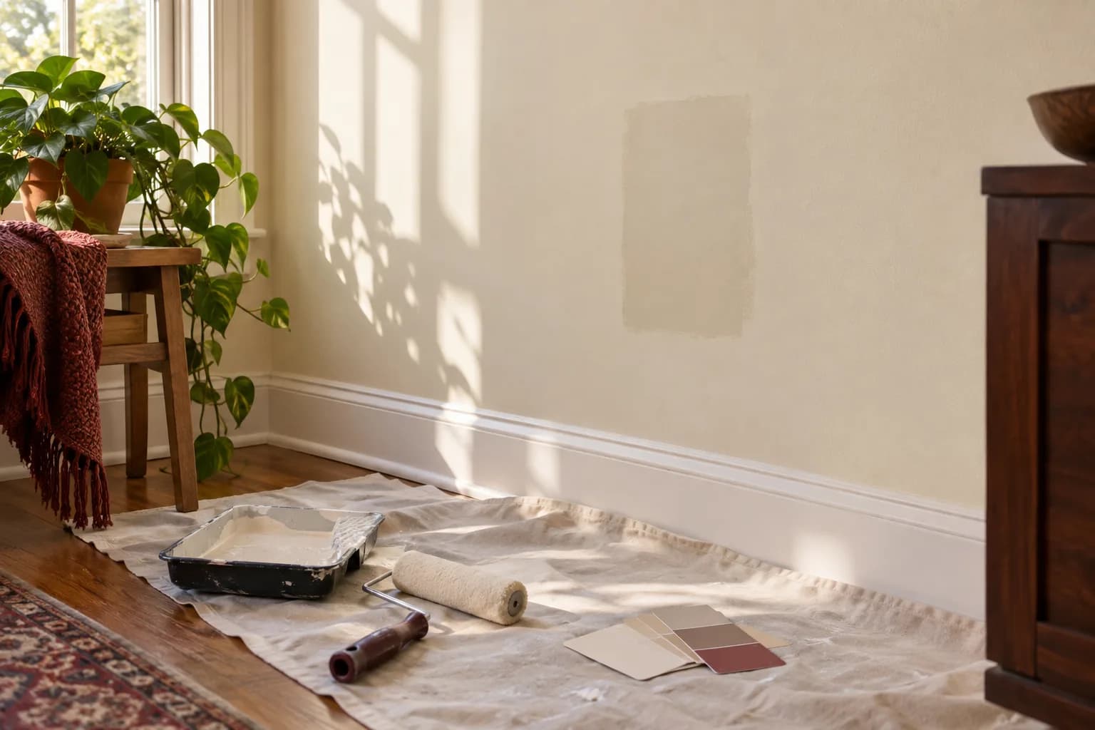
A paint chip lies to you a little — not on purpose, but because a 2-inch card under store lighting can't show how a color behaves across a whole wall, in your room's daylight, under your light bulbs, at different times of day. The fix isn't a better eye for color. It's testing bigger samples, in the actual room, under the actual light, before you commit to gallons.
Why the same color looks different in every room
Paint color isn't fixed — it's the interaction of pigment, the light hitting it, and the light bouncing off nearby surfaces (a red rug, a wood floor, a neighboring wall). Two things do most of the work in changing how a color reads:
- Where your daylight comes from. A room with windows facing one direction gets a different quality of natural light than a room facing another — the light shifts in color and intensity through the day and across seasons. A color that looks crisp and cool at midday can look flat or muddy in the evening.
- What kind of light bulbs you have. This one is measurable, and it matters more than most people expect.
Your light bulbs matter as much as your walls
Light bulbs are rated by correlated color temperature, measured in kelvin (K). The U.S. Department of Energy's Federal Energy Management Program describes white light as ranging from a yellowish (warm) white to a bluish (cool) white, and notes that this affects the appearance and mood of a space. It also advises buying replacement bulbs with a color temperature similar to what was used before, because a radical change — for example, from 2,700K to 4,100K — is noticeable and can leave the people using the room dissatisfied.
The DOE groups common color temperatures like this:
| Color temperature | DOE label | How DOE describes it | Where DOE lists it as typical |
|---|---|---|---|
| 2,700K | Warm | Friendly, personal | Homes, libraries, restaurants |
| 3,000K | Soft | Warm, pleasing | Homes, lobbies, restaurants |
| 3,500K | Neutral | Friendly, inviting | Executive offices, reception areas |
| 4,100K | Cool | Neat, clean, efficient | Offices, classrooms, showrooms |
What this means for paint: a color you chose under one kind of bulb can look noticeably different under another. A warm gray that feels cozy under warm bulbs may read cooler, flatter, or grayer under cool ones, and a crisp white can turn creamy under very warm light. If you're repainting a room, decide on your bulbs first, or at least test your paint samples under the bulbs you actually plan to keep. Many homes mix bulbs from different eras — one lamp warm, the ceiling fixture cool — so it's worth checking the rating printed on the bulb or its packaging before you judge a sample.
Test big, not tiny
A paint chip is too small and too flat to show you anything reliable. Two things fix that:
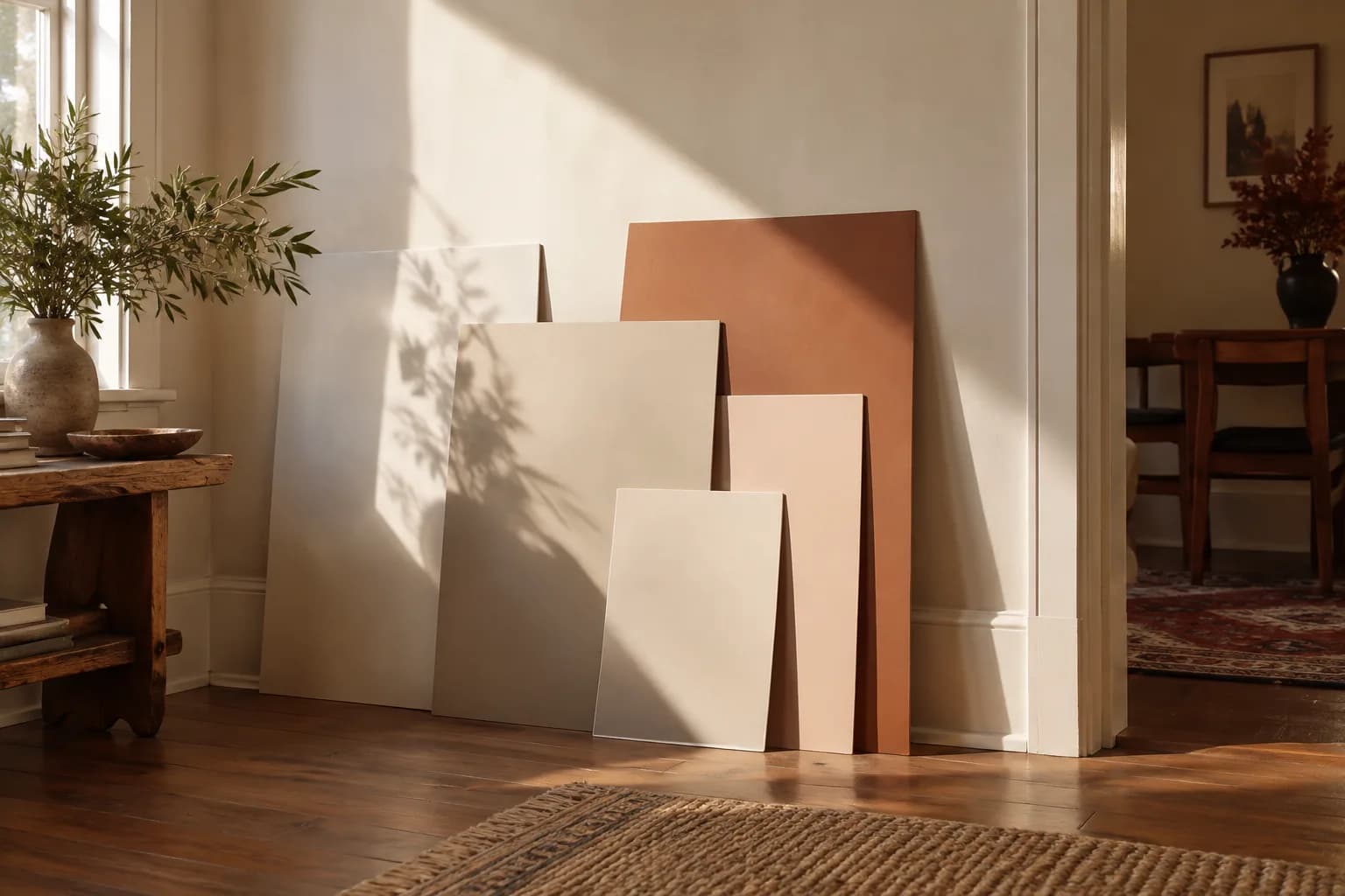
- Paint actual boards or large sheets (roughly 2 feet square) with two coats of your top 2–3 candidates, and move them around the room — hold them against the wall you're painting, near the floor, near the ceiling, in a corner. Color looks different depending on how much surrounding surface reflects onto it.
- Look at each sample at three points in the day — morning, midday, and evening with your lamps on. A color that looks right in the early afternoon can look quite different at night under lamps. Checking at several times of day is how you avoid choosing a color that only "seemed right" in the store.
Sheen changes the color too
The same paint color in matte, eggshell, satin, or semi-gloss will not look identical on the wall. Higher sheens reflect more light, so the same color can look a little different than it does in a flatter finish, and glossier paint tends to show wall texture and imperfections more. Matte and flat finishes absorb more light, deepening the color and hiding minor surface flaws — but they're harder to wipe clean. If you're testing a color, test it in the actual sheen you plan to use, not whatever leftover sample happens to be on hand.
A simple testing checklist
- Paint two coats of your top candidates on large boards or poster-board sheets, not directly on the wall (so you can move them)
- Match the sheen you'll actually use for the final coat
- View each sample against the wall, floor, and ceiling of the actual room
- Check morning light, midday light, and evening/lamp light
- Note what bulbs are in the room's fixtures — decide if you're keeping them
- Live with the samples for at least a full day before deciding
- Consider furniture and flooring already in the room — hold the sample near them, not just on a blank wall
Compare samples with the things that will stay
The wall does not exist in isolation. Hold a sample near the floor, countertop, trim, upholstery, and large wood pieces that are staying in the room. A color that looks neutral beside white paper can appear pink, green, or yellow beside another material. Compare the combination you will actually live with, not a set of disconnected chips under store lighting.
Choose a few candidates with a purpose. For example, compare one warmer neutral, one cooler neutral, and one color with more depth. Label each sample clearly so you can remember which is which after looking at them for several days. Too many nearly identical options can make the decision harder without revealing anything useful.
Movable sample boards let you compare opposite walls, corners, and the area beside a window. Use the paint and preparation recommended for sampling, and remember that a small sample's finish may differ from the final product. A useful test is large enough to see a field of color, not just a bright square surrounded by the old wall color.
Look at the room on an ordinary day
Check the sample when you normally use the room. A bedroom judged only at noon may feel different under bedside lamps at night. A home office used during video calls needs a check with the monitor on, window coverings in their usual position, and the camera showing the background. You do not have to optimize every light condition equally; decide which use matters most.
If you plan to replace the bulbs, do that before choosing the final wall color. Keep a note of the bulb model rather than relying only on a phrase such as warm white. Different lamps, shades, and dimmer settings can change the impression even when packaging uses similar words.
Do not trust a phone photo as the sole reference. Camera exposure, automatic white balance, and the screen used to view the image can all change what you see. Photos are useful for comparing layouts and discussing a palette, but the painted sample in the actual room should make the final decision.
Turn the chosen sample into a clear painting order
Write down the manufacturer, color name and code, product line, sheen, and which surfaces receive it. List walls, ceiling, doors, and trim separately. Keep the label or a photograph with your home records. “The cream we liked” is not enough information for a later touch-up or another room.
Ask the painter how repairs and primer will be handled before the finish coat. Then evaluate the completed color only after the coating has dried according to the product instructions. If an existing patch still flashes at an angle, the cause may be texture or sheen rather than the color itself; our touch-up guide explains that distinction.
FAQ
Does the color on my phone or laptop screen match the real paint? Not reliably. Screens display color differently depending on brightness and calibration, so a photo or digital swatch is only a rough guide — always confirm with a physical sample in the room.
Should I match my new paint to my existing light bulbs, or plan to change the bulbs? Either works, but decide before you paint. If you're not planning to touch the bulbs, test your paint samples under those exact bulbs. If you're switching to a different kelvin range as part of the refresh, test under the new bulbs instead.
Why does the same "white" paint look different in every room of my house? White paint has an undertone — a hint of blue, yellow, green, or gray in the base — and undertones are exactly what shifts most with different light. That's why the identical can of white can look slightly cool in one room and noticeably warmer in another, depending on how much daylight each room gets, when it gets it, and which bulbs are in the fixtures. Test whites in every room you plan to use them in, not just one.
Do darker colors need more coats than lighter ones? Often yes, especially when covering a much lighter existing color — but that's a coverage question tied to the specific paint and colors involved, not a fixed rule. A test patch will show you before you commit to buying extra gallons.
Getting it right the first time
Picking the right color is only half the job — even the right color can look uneven if the prep, priming, and application aren't handled carefully, especially in older homes with plaster walls and years of built-up paint layers. If you'd rather test your samples and hand off the actual painting, request an estimate and we'll walk through colors, sheen, and scope together. You can also see how we approach the work on our painting services page.